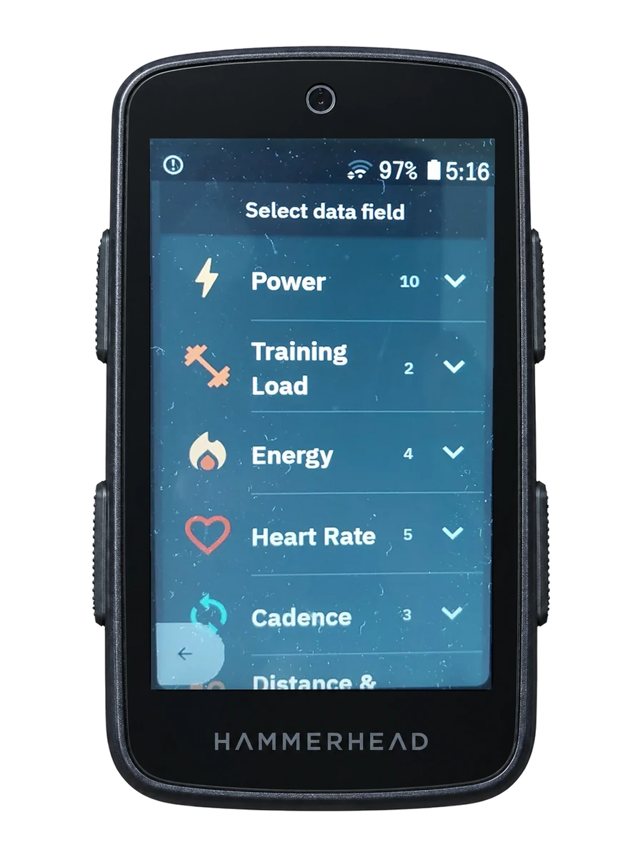
Some data makes more sense when it stops being only a number
Power: 243 W. Heart rate: 151 bpm. Gradient: 7%.
Those numbers are precise, but during a ride the exact value is not always the main question. Often you need to understand what it means, quickly.
VinHkE offers different ways to present information so that interpretation takes less effort.
Colour that identifies a zone
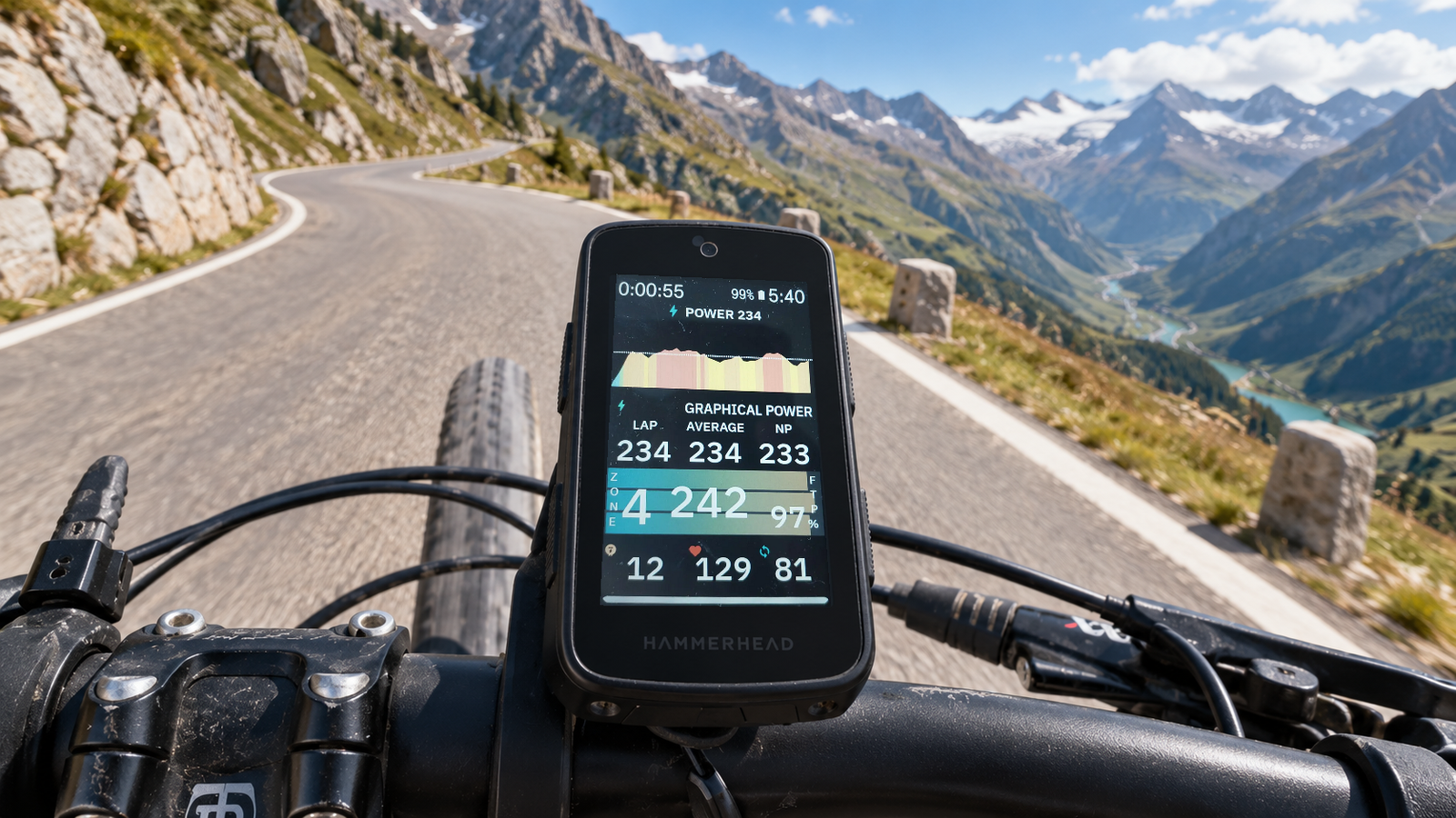
Coloured fields can make the intensity behind a metric immediately recognisable.
Instead of reading the number and then interpreting it, the field itself can help you recognise the zone.
This is particularly useful for power, heart rate and gradient.
Several metrics inside one field
Some fields combine related information into a single view.
Instant power, average power, interval power and normalised power can sit together without taking four independent spaces on the screen.
The same idea applies to other metric families.
Charts show change, not only the current moment
A single value tells you what is happening now. A chart shows how you got there.
VinHkE includes graphical views for power, heart rate and other metrics so you can follow how they change during the ride.
During a workout, climb or sustained effort, that perspective can be far more useful than one number.
You decide how much you need to see
The goal is not to fill the screen.
It is to have the right amount of information for each situation.